Take Your Learning to the Next Level! See More Content Like This On The New Version Of Perxeive.
Get Early Access And Exclusive Updates: Join the Waitlist Now!
Take Your Learning to the Next Level! See More Content Like This On The New Version Of Perxeive.
Get Early Access And Exclusive Updates: Join the Waitlist Now!
I build businesses, both as independent startups and as new initiatives within large global companies. This series of posts is based on an FX Options training course that I delivered whilst contributing to building FX businesses at a number of investment banks. If you are looking to build a business and require leadership then please contact me via the About section of this website.
In this section we continue our deep dive into volatility. To get the most from this section you should first have covered the relevant previous sections and in particular options valuation, option risk characteristics, gamma and the start of our deep dive into volatility.
Clients often request salespeople to provide them with volatility charts as part of the pre-trade decision making process. Volatility data whilst not difficult for clients to source is much less widely available than cash data. The quality and breadth of volatility data provided by different banks is not consistent. Being able to service clients’ requests for volatility data and charts is therefore a relatively high value opportunity. The opportunity to engage a client in a discussion about volatility is an opportunity to differentiate FX services.
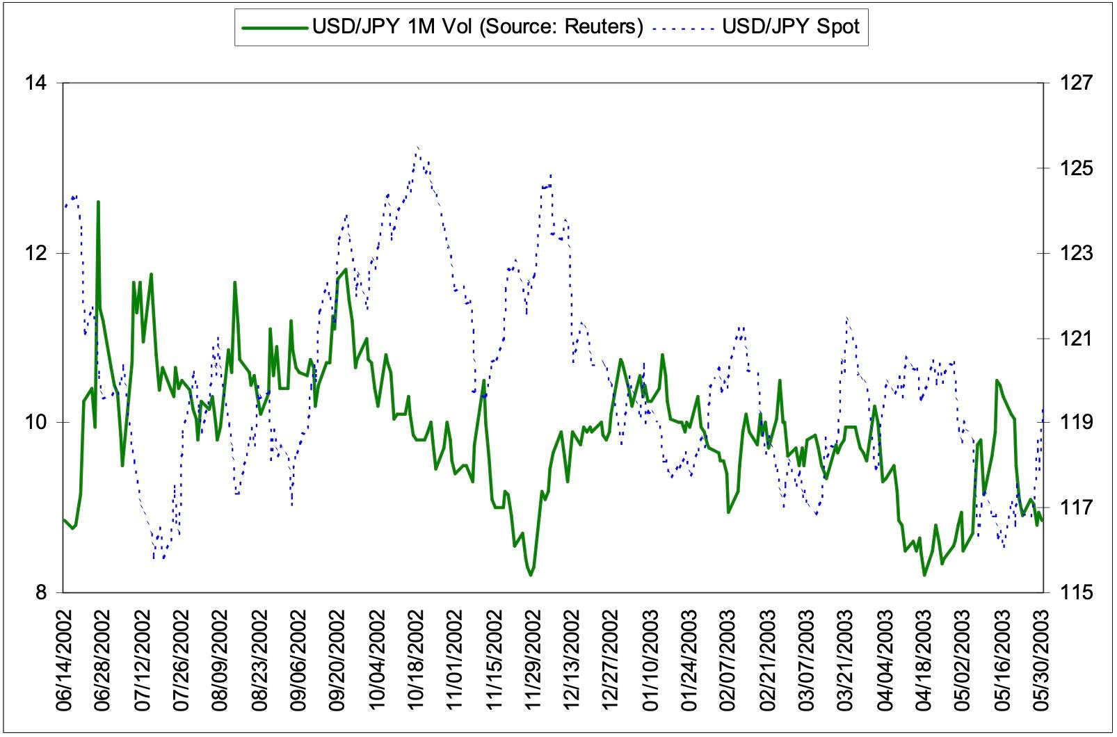
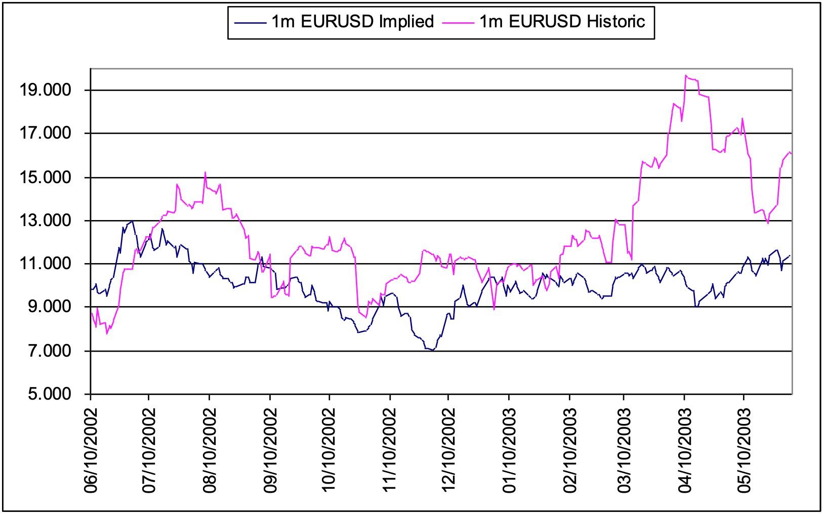
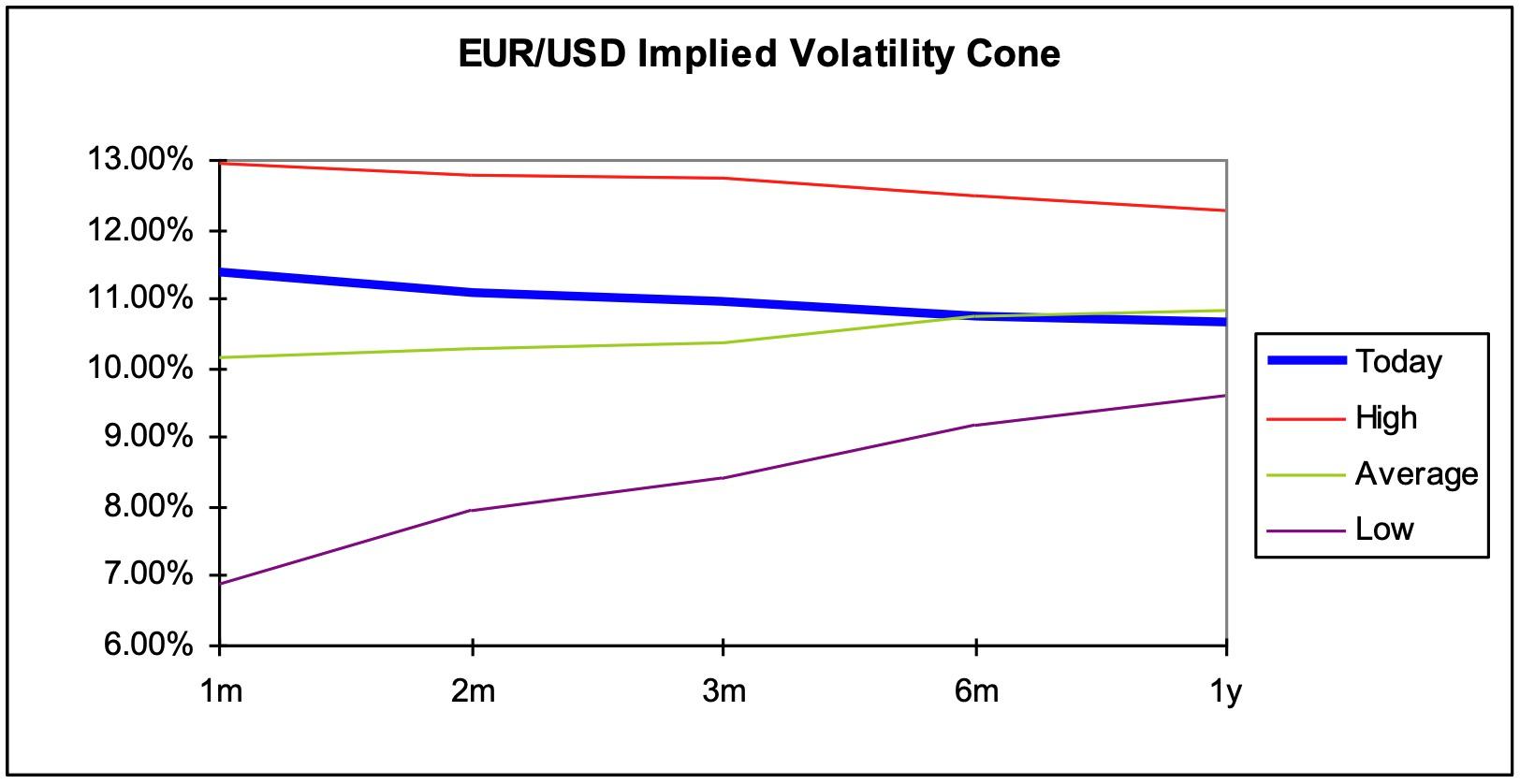
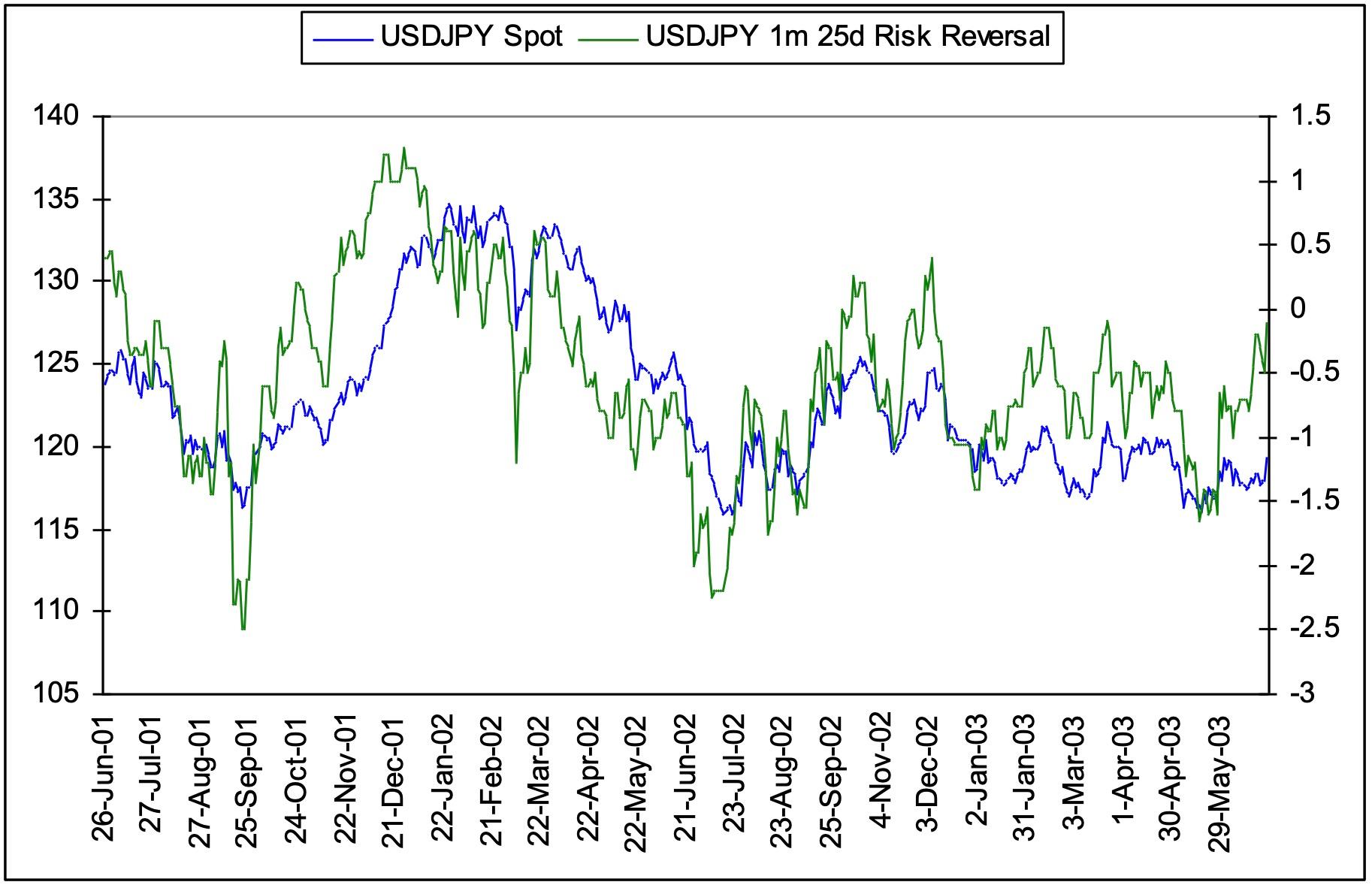
There are four commonly requested volatility charts:
Charts of implied volatility versus spot show how volatility reacts to changes in spot. For example, it may help answer the question: Is there a relationship between the direction of spot and the direction of volatility? It also helps identify the behaviour of the spot market during significant changes in volatility.
Charts of implied volatility versus historical volatility show how much implied volatility is influenced by the actual volatility seen previously in the market. Historical volatility partially determines the the return of a hedged option position in that it partially determines the historical cost of delta hedging. It follows that the difference between historical and implied vol would be an indicator of relative richness / cheapness of implied volatility if spot continues to behave the same as the recent past. Whilst historical volatility is not necessarily a good predictor of future volatility the relationship is followed by traders.
Volatility cones show the current term structure of volatility relative to the high, low and mean level for the period of data covered by the chart. Given the tendency for volatilities to mean revert, the position of the current volatility curve within the cone could give indications of how volatilities may change. Also, volatility cones highlight when volatilities are at extreme levels.
A chart of the risk reversal against spot can be used to identify the significant levels in spot that can cause the risk reversal to change. The risk reversal is a function of market makers expectations of the direction of volatility for a given move in spot and is also a reflection of supply and demand in the market. The risk reversal can often be a leading indicator of the move in spot and the chart can be used to identify turning points in the risk reversal. The chart also gives an indication of the extremes that can be expected in the risk reversal for a spot move of a given size and speed.
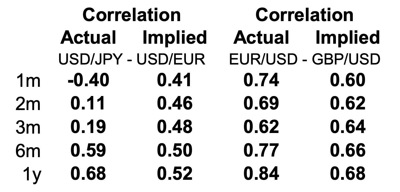
Correlation is an important input in the calculation of a cross volatility for two given volatilities for related currency pairs. Given three volatilities that have a triangular relationship the implied correlation can also be calculated. Comparing this implied correlation to the actual historical calculation can be instructive.
Comparing actual correlation and implied correlation is much the same as comparing historical volatility to implied volatility in that one is backward looking, the other is forward looking.
For example the daily Options Analysis provides a comparison between the actual and implied correlation between GBP/USD, EUR/USD and EUR/GBP and USD/EUR, USD/JPY and EUR/JPY.
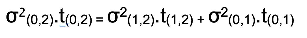
Implied correlation, ρ, is calculated from the component volatilities according to the relationship:

The volatility cone chart above shows the term structure of volatility relative to its high, low and mean. The curve moves within the volatility cone and trades can be structured to take advantage of these moves. One way of trading the volatility curve is to trade forward/forward volatility. That is, to trade a contract to buy or sell volatility of a particular maturity for a given price and a given date in the future.
Forward/forward volatility is calculated from the volatility curve according to the relationship:
As for other financial prices, attempts have been made to forecast FX volatility. To be clear, what is being forecast is the expected actual or realised volatility over a period of time. There are a number of features of volatilities that it is useful to be familiar with, some of which are described below.
Mean reversion refers to the tendency of volatility to revert to some long-term average level of volatility. The best way to picture this is the volatility cone, which shows the volatility curve trading around an average volatility level. The interesting empirical observation from volatility cones is the tendency for the average level of volatility to be the same for different maturities for the same currency pair. The difference is the range in which the volatilities to different maturities trade. Short dated volatilities are themselves much more volatile in trading around the mean.
In observing a time series of volatility data it is found that periods of high volatility tend to be followed by further periods of high volatility. Similarly, periods of low volatility tend to be followed by periods of low volatility. This is often referred to in the form of “Autocorrelation” or the observation that for time series data one data point is correlated to the previous observation.
If volatility could be forecast, the implied volatility could be compared to the forecast and the relative value determined. Implied volatility is most commonly compared to historical volatility. However this is not necessarily a good predictor of future volatility.
Given the tendency for persistence and autocorrelation, a moving average approach would intuitively have some value. In particular, a weighted moving average that gives the greatest weight to the most recent observations would be one way of modelling volatility.
There have been two particular types of Moving Average that have been widely used in volatility estimation, ARMA and ARIMA. In both cases the “AR” refers to Autoregressive. Remembering that a regression is a statistical method for investigating the dependencies between variables, we can extend that intuition to an autoregressive process in which adjacent observations in a time series are linearly related. So ARMA, Autoregressive Moving Average is a moving average that takes into account the interdependence of adjacent observations. ARIMA, Autoregressive Integrated Moving Average, is an extension of ARMA that reduces a non-stationary time series to an ARMA time series.
The next extension of models that are used to forecast volatilities are ARCH and GARCH. These have even more difficult names. ARCH stands for Autoregressive Conditional Heteroscedasticity. G in GARCH is Generalised. So GARCH is generalised ARCH. What does it mean?
ARMA models assume a constant variance and do not incorporate additional information about the variance. For example, if a particular time series of data were observed to have unusually volatile returns and the volatility of returns is expected to continue to the next observation, then the ARMA models would not be able to capture this information. A process that has a variance that changes over time is called Heteroscedastic. This means that the distribution of returns in the time series will have fat tails, or in other words there will be more outliers in the distribution of returns than a normal distribution would lead you to expect.
ARCH and GARCH models allow for the mean and the variance of the returns of a time series to vary over time. This is useful in forecasting FX option volatilities, which are themselves volatile and which exhibit a varying mean over time.
In the next section we continue our introduction to FX options by looking how a salesperson on the FX desk of an investment bank might execute an option trade.